Brand & Mission Statement
The brand "City of Linz at the Rhine
With the words "colourful life", the new brand essence unites all the attributes for which the city of Linz am Rhein stands. The most important elements of the new brand are the words "home", "tradition", "history", "Linzer", "community" and "tourism". Together they form the brand essence "Colourful Life", which stands for joie de vivre, tolerance, originality, cordiality, friendliness and future orientation.
"Colourful Life" brings together the multitude of ideas from the brand development workshops and at the same time picks up the original and nationally very well-known claim "The colourful city on the Rhine". Already since the early 1930s, the city of Linz on the Rhine has borne this epithet due to its colourful and richly decorated half-timbered houses as well as its diverse, "colourful" programme of events. In view of the high recognition value, the claim was retained and merely shortened by the word "the".
The logo of the "Colourful City at the Rhine
Along with the new brand identity, a new colourful logo was developed as a visual implementation of the brand essence. The logo is colourful, reflecting the fun-loving attitude through the lightness of the claim (motto under the logo). The wavy font shape incorporates the Rhine as a central element in the appearance without showing it directly. The deliberately chosen colours are all taken from the urban area of Linz am Rhein and stand for the Rhine (blue), the cordial and the associations (red), the history and the city (yellow) and nature and originality (green).
The city silhouette as a pictorial component in the logo shows important and central buildings of the city and not only creates a link to architecture and history, but also to Linz landmarks as places that create identification.
Development of the new brand "Linz at the Rhine"
At the beginning of 2018, an extensive brand development process was initiated to realign the city of Linz with the aim of positioning Linz uniformly to the outside world with a modern and future-oriented brand. The implementation was carried out by the agency Shapefruit AG from Bad Neuenahr-Ahrweiler.
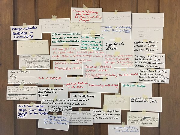
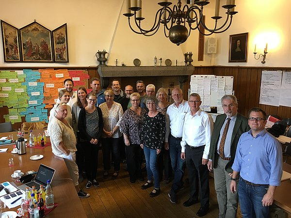
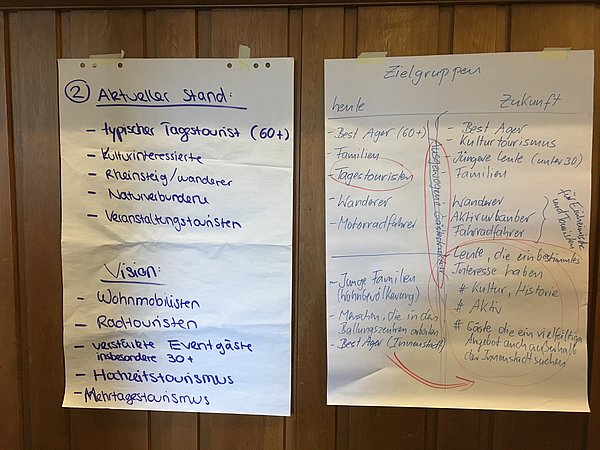
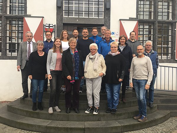
The particular challenge in the project was to obtain as representative and broad an opinion as possible from the population and at the same time to implement a constructive and efficient process. For this reason, a working group was formed with representatives from various Linz interest groups (trade, crafts, tourism, sports, clubs, youth, citizens' groups, commerce, hotel industry), which dealt with the strengths, weaknesses, opportunities and threats as well as values, visions and goals of Linz in workshops moderated by the agency. In addition, numerous suggestions and ideas from the population were integrated into the branding process.
Based on the very comprehensive and creative results of the first workshop, the agency developed ideas for the brand definition and the future logo. The new logo was adopted by the city council in January 2019 and presented to the public with great interest in the Stadthalle Linz.